
Introduction
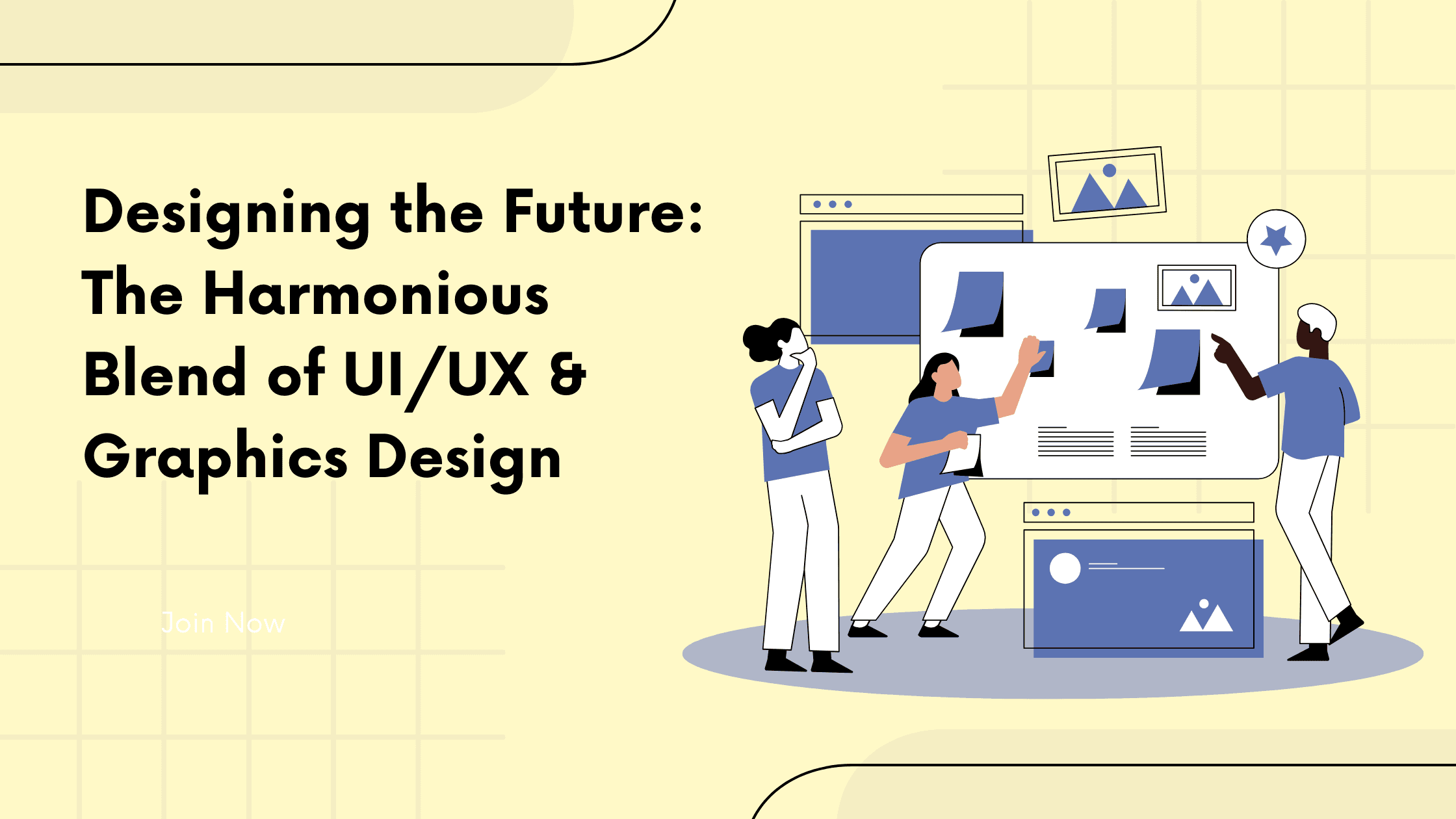
UI, UX and graphic design get treated as three separate jobs, often handed to three separate people. On a real product they're one decision seen from three angles. UX decides what the user needs to do and in what order. UI decides what they see and press to do it. Graphic design decides how it looks and what it says about the brand. When the three disagree, users feel it straight away, even if they can't name why. Here's how they fit together, and where projects usually go wrong.
The Power of First Impressions
People judge a product within seconds of opening it, and they judge the look and the usability together. A beautiful screen with a confusing flow loses them. So does a logical flow that looks unfinished. Good design is the point where both hold up: the product looks trustworthy and the next step is obvious. Each discipline owns a different part of that first impression.
User Interface (UI): UI is everything the user sees and touches: buttons, forms, icons, menus, states. Every one of those choices tells the user what they can do and what will happen when they do it.
User Experience (UX): UX is the path through the product. Which screens exist, in what order, and how many steps it takes to finish a task. Good UX is mostly invisible: users get where they're going without thinking about how.
Graphics Design: graphic design is the visual language: typography, color, imagery, spacing and hierarchy. It's what makes a working interface feel like a specific brand and tells the eye where to look first.
The Dance of Creativity and Functionality
The friction between creativity and function is useful. A bold visual idea is only worth keeping if the user can still find the button, and a strictly functional layout usually benefits from one strong visual decision.
Typography Matters: type sets the tone before anyone reads a word. Serif faces tend to read as traditional and established, sans-serifs as modern and direct. Pick one or two families, use them consistently, and make sure body text is comfortable to read at small sizes.
Color Psychology: color carries meaning, so use it on purpose. Red reads as urgency or error, blue as calm and stable. Reserve your strongest color for the one action you most want users to take, and check that every text color has enough contrast against its background.
Visual Storytelling: diagrams, illustrations and screenshots explain in a glance what a paragraph struggles to. Use them where the idea is hard to put into words, not just to fill space.
Consistency is Key: the same button should look and behave the same everywhere. Consistency lets users build a mental model of the product, so each new screen feels familiar. A shared component library is the practical way to hold it.
Creating Memorable Experiences
Products people remember are the ones that respected their time. That starts with knowing who the users are, what they're trying to get done, and where they currently get stuck.
Human-Centered Design: start from real users and real tasks. Talk to the people who'll use the product, watch them use the current version, and design around the problems you actually see.
Iterative Design: the first version of a screen is rarely the right one. Prototype, test with a handful of users, fix what trips them up, and repeat. Cheap prototypes make this fast; code makes it expensive.
Inclusivity and Accessibility: design for everyone who might use the product, including people using screen readers, keyboards or larger text. Sufficient contrast, clear labels and visible focus states are where UX and graphic design meet, and they make the product better for every user.
Conclusion
The best products don't let you see the seams between UX, UI and graphic design. They come from teams that make those decisions together, test them with real users and hold them in a shared system as the product grows. If you're planning a new product or reworking one that users struggle with, start with the flow, design the interface around it, and let the visual language carry the brand.